
Image verification
Image verification

Useful resources
Among researchers and scientists worldwide, there is a common saying: “Without data, you’re just another person with an opinion”. This phrase perfectly captures the critical role data plays in verifying information or hypotheses: confronting reality. Data is not a random collection of numbers open to interpretation but a concise representation of the world around us.
This is why the world of information relies heavily on data. It is used to describe trends in specific topics, support claims in articles, and test the truth of statements by politicians or public figures. However, data is often used improperly. Sometimes, this is due to misunderstanding, other times due to ambiguity aimed at supporting specific arguments, and occasionally with the explicit intent of spreading fake news.
In this article, we’ll explore some of the key elements to consider when working with data and graphs, both to better appreciate their ability to simplify complex phenomena and to avoid being misled by improper representations.
Statistics can be collected and presented in countless ways. One crucial distinction is between quantitative statistics, measurable through numbers (e.g., the number of cars sold in Italy last year), and qualitative statistics, related to specific qualities or attributes of a phenomenon (e.g., opinion polls conducted within the European Union, known as the Eurobarometer). Quantitative statistics are more commonly used in journalism and research and are also more prone to manipulation. Many principles we’ll examine, however, apply to both types.
Choosing the right sample
The first critical factor is the representativeness of the statistics we are dealing with. Data collection aims to describe the phenomenon under study as accurately as possible. For instance, if we want to determine how many people are employed in our country, the most effective method would be to visit every home nationwide and ask. However, this kind of large-scale survey would be prohibitively expensive and resource-intensive: tens of thousands of interviewers would have to meet thousands of people traveling all over the country.
Statistics help overcome this challenge through sampling analysis. Using statistical tools and mathematical calculations, it’s possible to estimate a phenomenon affecting the general population by analyzing only a small fraction: a sample.
However, this sample must be representative of the population. For instance, if we want to gauge Italians’ political opinions, the sample should include roughly equal numbers of men and women, proportional age groups (young, adult, elderly), individuals from various regions reflecting their population weight, and so on.
If a sample is sufficiently representative, even a small number of respondents can yield highly accurate results. National political polls, for example, often rely on just a thousand or so respondents to estimate the choices of millions of voters.
However, if the sample loses representativeness, the number of responses required increases significantly. A poorly selected sample may distort the results. For instance, a poll on voting intentions conducted on the Instagram account of a political party leader would likely show overwhelming support for that party – regardless of the sample size – due to the bias of respondents who share similar political views.
This is known as selection bias, an error occurring when the sample does not accurately represent the population being studied but instead reflects a subset with common characteristics.
Selection bias can result not only from errors in sample selection but also when individuals choose to participate (or not) based on their characteristics. For example, an online survey on interest in rock climbing is likely to attract responses mainly from enthusiasts of the sport. After all, would you spend ten minutes of your time answering questions about something you know and care nothing about?
There is also an increasingly common phenomenon of people choosing not to participate or lying in the interview for political reasons. During the 2016 US elections, for example, polls significantly underestimated support for Donald Trump, who ultimately won. This error was likely due to Trump voters’ skepticism toward institutions, leading them to avoid survey participation. Probably, upon answering the phone and realizing they were speaking to a polling company –perceived as part of the establishment – these individuals were less inclined to waste time answering the questions. This led polling organizations to construct samples that, in theory, were representative of the electorate, with a proportion of Republicans matching the general population. However, they ended up interviewing mostly moderate Republicans, underestimating the role of the party’s more extremist voters.
Mean vs. Median
Another key concept for interpreting numbers effectively is the mean. When we think about the arithmetic mean—the sum of all the data divided by the sample size—we often assume it accurately reflects the population.
For example, if we know that in a town of ten residents, the average income is €100,000, we might expect that if we stopped one of those residents and asked about their income, they would report a figure close to that €100,000 average. However, it is far from certain that most residents’ incomes are near this value. For instance, nine of the ten residents might earn only €1,000 each, while a single resident earns €991,000. The mean – calculated as €991,000 plus €9,000 (nine people earning €1,000 each), divided by ten (the number of residents) – is indeed €100,000 per resident, but the distribution of this income tells a very different story.
This extreme example highlights a major limitation of the mean: on one hand, it is a highly concise indicator, summarizing useful information in a single figure, such as an approximate measure of a country’s income. On the other hand, this conciseness reduces its representativeness. A single figure cannot fully capture a nuanced situation like the one illustrated above.
Even in less extreme cases, the mean can be misleading, usually due to the presence of outliers – data points with extreme values, like the millionaire in our ten-person village. Income is one of the most well-known cases where caution is needed when interpreting the mean. This is because incomes are typically distributed in a specific way: most people earn lower-to-middle incomes, while a minority earns disproportionately higher amounts. The presence of these high incomes significantly raises the mean, giving the impression that the general population earns more than they actually do.
Understanding how to interpret the mean correctly is also crucial in the realm of journalism. It’s not uncommon for average income data to be presented as representative of the “middle class.” Viewers or readers, who often identify as middle class, may feel anger or disappointment upon discovering they earn less than the average, assuming the figure represents their “social reference class”. As we’ve seen, though, the mean is often overestimated.
How can we better understand the state of the middle class? By using the median, an indicator that splits the population into two equal halves: half earn above this value, and half earn below it. For example, if the median income in a ten-resident town is €50,000, it means five residents earn more than €50,000, and five earn less. In the earlier example, the mean income was €100,000, but the median income would be €1,000 (in this case, nine out of ten data points align with the median value).
This difference is also clear in data about Italy. In 2021, the average hourly wage for employees was €14.79, roughly €2,366 gross per month for full-time workers. However, the median wage was lower at €11.69 per hour, or €1,870 gross per month – a figure much closer to most Italians’ perception of wages. To make our analysis even more comprehensive, we could also consider other thresholds, such as how much the top 10% or bottom 10% earn.
Understanding the concepts of sample representativeness and averaging is already an important tool for interpreting data, but there are many things to learn about analyzing statistics. To learn more advanced statistical methods in a very popular way, a very useful resource is masteringmetrics.com, edited by the 2021 Nobel Prize winner in Economics Joshua Angrist.
How not to be misled by graphs
One of the most useful tools for disseminating data – and thus for misrepresenting it if used improperly – is data visualization, the creation of infographics that present data in a clear and immediate visual format.
These infographics can range from simple graphs, such as a line chart showing healthcare spending over time, to complex works that simplify understanding of extensive datasets, such as this visualization of Apple’s revenue streams.
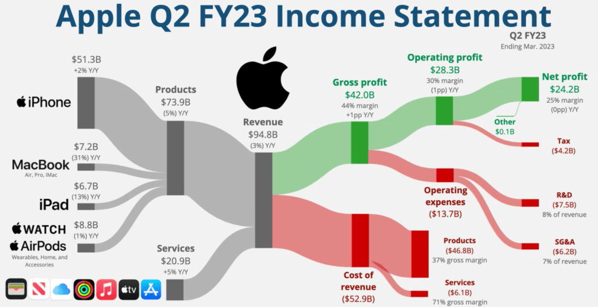
While the complexity of these two examples differs significantly, both demonstrate how visualization reduces complexity. In the healthcare spending example, instead of presenting a table with yearly values, a simple line chart suffices to show changes over time. For Apple’s revenue, a single infographic summarizes most of the essential information from an entire financial statement.
Infographics, however, can also deceive – not only by presenting incorrect data but by representing it inaccurately. Avoiding these pitfalls requires expertise, but some common tactics used in information media are relatively easy to recognize. Let’s look at a couple of examples.
One frequently cited case involves bar charts, which often appear in articles and TV reports. To emphasize differences, the vertical axis is sometimes truncated, as in this graph of Brexit referendum voting intentions.
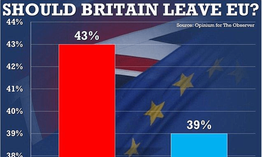
In this example, it seems that most UK citizens favored leaving the EU, which is partially true, as it was the largest group, but it also suggests that almost no one wanted to remain. In reality, the race was much closer, with “Leave” and “Remain” separated by only four percentage points.
Magnifying the chart’s final section creates a great and misleading visual impact: it could either motivate “Remain” supporters to vote or discourage them from voting by making the gap appear insurmountable. Changing the size of the Y-axis (the vertical one) is more than legitimate and often really helps to put these things into better perspective. However, it is important to check what effect this enlargement has: did the person who did it want to give us a better understanding of the phenomenon or try to show the data from a biased perspective?
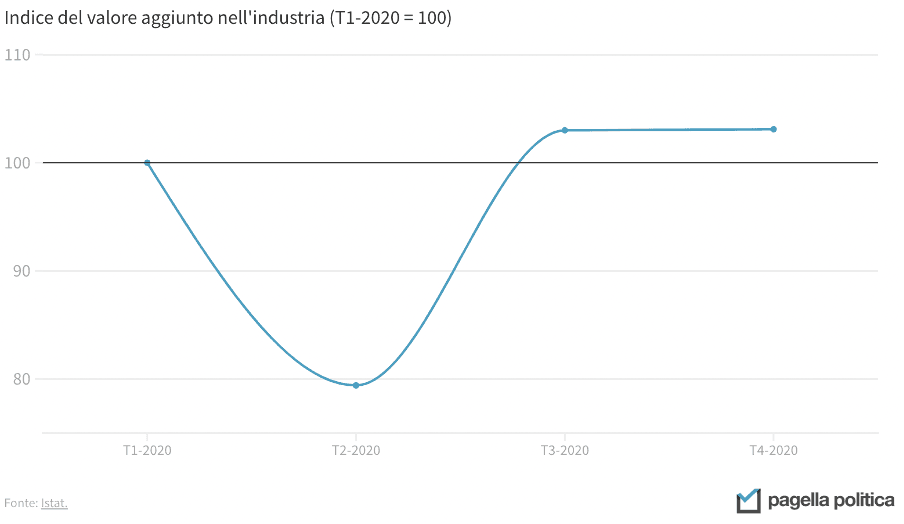
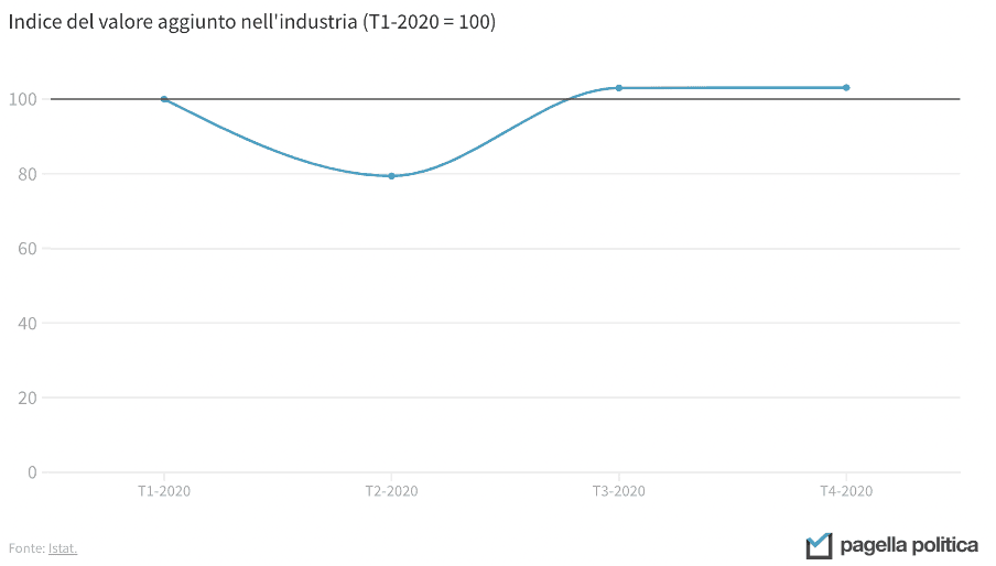
The incorrect use of the vertical axis does not only concern bar graphs, but also line graphs. The two graphs below, for example, show the same data, but the message that comes through is different: in the first case, it appears that the Italian industry has come to a complete standstill at the time of the collapse, while in the second, this perspective is more contained. In both cases, considering that the drop was 20 percent, the representation is perhaps a little extreme. A good middle ground might be to set the minimum of the Y-axis at 50.
Data and infographics underpin the work of many journalists, policy makers and, of course, scientists and analysts. Understanding their potential and learning how to interpret them in the right way is the key to understanding the reality around us. Data are then crucial for assessing the impact of policies that want to change that reality, helping us to understand whether they have been effective and where they can improve. Without a constant reality check through data, being truly informed is impossible. Because without data, you are just another person with an opinion.